The "Simplification" of User Interfaces
Much has been written about the dumbing down of interfaces. I am no expert, but I have enjoyed the Toasty Technology GUI Gallery, and especially the pages about particulary bad GUIs (Microsoft BOB, Windows 8, Abusive Appliance Interfaces)
But I digress. I was thinking one day at work about how software sometimes is "updated" with a new UI, so it is easier or more "intuitive" to use. An example:
For two summers, long ago, I worked for the Pennsylvania Department of Transportation (PennDOT). My job was to inspect drains (read: pipes under the road), guiderails, and the shoulder of state roads. Of course all of this data was entered into a computer program on some dell laptops, and later exported to the mainframe in Harrisburg. Yes, per my observations it was an actual IBM mainframe, although I can not be 100% sure. I was able to find an image of one of the laptops running the software in a PDF.
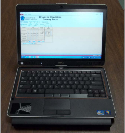
You may notice how the layout seems like they just took what they already had on paper forms and placed it on a screen. You would be correct. The form wasn't the prettiest, but it got the job done. After about two weeks of working with it, everyone could fill each survey out fast. This was my first year. For my second year, the form would be redesigned, with the intent being to eventually move to iPads instead of laptops. It was clearly an attempt to make things more "intuitive" and more like an app from the app store. It certainly looked prettier.
But it wasn't easier.
It didn't save time or effort.
In fact, it felt like a step backwards to me, and my coworkers seemed to agree. My process for filling a form was to use the tab key to go through each field, and then use my left hand to input the data (all numbers for every field). As anyone who has seriously used a computer knows, the TAB key is very handy. The first major sin of the new software: the tab key did NOTHING. It seemed to me to be an oversight of great magnitude, because now you had to click into each form and then fill it out.
But thats not all. In the old form, clicking would be slower, but you would just move around one page worth of space. Manageable on a laptop sitting in a car. In the new form, each survey question took up a page, leading to tons of scrolling. This was amazingly unfun. Imagine a touchy, infinite scroll webpage on a mobile phone. It was that exasperating, because it scrolled ... so ... SLOW. Very quickly everyone brought in a spare USB mouse to hook up to their computers. I had my trusty USB intelimouse. It made things less annoying, and luckily we had a bench seat, so there was plenty of space to use a mouse.
But my point here is not to relay a mundane story of imperfect design. My point is to speculate how design like this happens. How is it that such things come into being? That was the course of thought I mulled over as I sat at work. I came up with the answer in the form of a story.
The year is 1970. You have been tasked with creating the new payroll software for the University of XXX. You have all of the resources of an IBM System 370 at your disposal, and all the Computer time you want starting at 11:00 p.m., ceasing at 8 a.m. Resources are scarce, so you create bare minimum software, it does what needs done and nothing else. It does this task well. To operate it requires a solid knowledge base, gained from some documentation and gleaned from the others who use it, day in and day out. For the uninitiated, it is the Minotaur's Labyrinth, but for those who use it religiously, it gains the comforting familiarity of the family chapel.
The software runs, and ages, and soon is a relic of a bygone era. “The software isn’t friendly for new users!” the uninitiated cry. Nevermind that very few will ever need to be initiated. Very few will need to use it. Instead the old software is torn down. It is replaced with a new effort. But this a modern age, with modern computing resources. No longer is the programmer constrained to batch processing, odd hours, limited memory. They can have their own server, real or virtualized. One hundred fold the memory, one thousand fold the speed, and a plethora of ways to program. The creation of the core of the program is simplified, and you can check all sorts of error conditions. This is good. The software gains new ability to cope with all the garbled input that could possibly be thrown at it by the world’s 9-5 typewriter wielding monkeys.
But all is not right. An interface straight out of 1970 will not due. It is not friendly enough. It does not allow the user to toss caution and documentation to the wind. Besides time spent writing documentation could be used to wrest more programming out of the programmers. No one likes writing documentation either, so resistance is minimal. By this point the software steering committee, headed by an assemblage of vice-deans and important personages, is giving their scattergun input. Bigger buttons, a fresh, futuristic look. “This software is the face of the university”, they claim. It must be properly branded. It must comply with all of the University Style Guidelines as laid out in Section 143.4 Table A-7. But just have the coders do it, we don’t need to hire any designers.
The damage is done. The modern interface does not pay homage to the paper that preceded it. It does not concern itself with limited memory, or with completing input with only a keyboard. The future is touch, the future is smooth. The future therefore destroys the good from the past, the keyboard shortcuts and the ability to do quick input. Information is spread out over many screens, no longer needing to fit on one form on a terminal. Software becomes simple, it protects the new user instead of giving an advantage to those who become attuned to the software.
This is not a new argument of UI or software design. And I don't know the answer. Easer to learn is good, but when power starts to be removed I think it is to the detriment of the user. I'm certainly glad we have the computing power to spend on fancier software, as it increases accessibility to all users (increased ability to theme, resize, etc.).But this doesn't mean the software must abandon all of its heritage. Pretty and Precise. Simple to wield but with great power. These are the goals.